Heuristic Analysis
Industry
E-commerce
Client
Hawkins
Platform
Mobile
Timeline
5 days
In-short, a little about the project…
Conducted a heuristic UX audit of the Hawkins mobile website and redesigned key commerce screens to reduce cognitive load, improve product discovery, and strengthen purchase decision-making.
Major, major, major issues
The mobile website introduces friction across the shopping journey due to:
Overloaded entry experience on the homepage
Inefficient browsing and comparison on product listing pages
Weak information hierarchy and CTA clarity on product detail pages
These issues increase cognitive load, slow down exploration, and reduce purchase confidence.
Scope & Focus
To keep the exercise focused and realistic, I evaluated and redesigned only three high-impact stages of the commerce funnel:
Homepage – Entry point and orientation
Product Listing Page (PLP) – Browsing and comparison
Product Detail Page (PDP) – Decision and conversion
Navigation redesign was intentionally kept out of scope.
Key UX problems that we identified

Homepage — Cognitive Overload
Issue
The homepage surfaces too many competing sections at once, making it difficult for users to quickly understand where to begin.
Heuristic Violated
Aesthetic & Minimalist Design
Why It Matters
High cognitive load at the entry point slows product discovery and increases early drop-offs, especially on mobile devices.

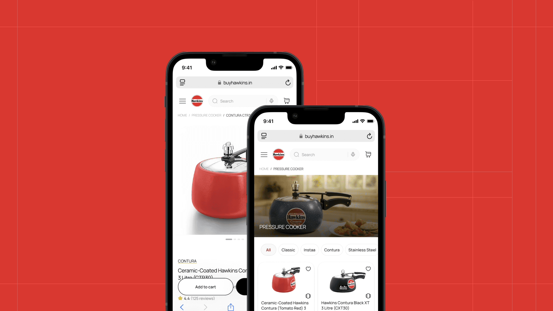
Product Listing Page — Faster Browsing & Comparison
Issue
The PLP lacks filtering and sorting controls, forcing users to rely on memory rather than recognition while browsing products.
Heuristic Violated
Recognition rather than Recall
Why It Matters
Without comparison aids, users struggle to narrow options, increasing frustration and abandonment during exploration.

Product Detail Page — Weak Decision Clarity
Issue
Primary and secondary actions compete visually, and product information lacks clear grouping and hierarchy.
Heuristic Violated
Consistency & Standards
Why It Matters
Unclear hierarchy increases decision fatigue and reduces confidence at the final conversion stage.
Concept Redesign — Key Design Decisions
Homepage — Reduce Cognitive Load & Improve Entry Flow
What Changed
Reduced the number of visible sections
Prioritized key product categories as primary entry points
Introduced a clear primary CTA
Removed redundant product and promotional blocks
UX Outcome
Users can quickly understand what Hawkins sells and where to start within seconds.

Product Listing Page — Faster Browsing & Comparison
What Changed
Added filter and sort controls for user control
Improved product card hierarchy (image → key info → price → CTA)
Removed non-product content from the listing flow
Standardized category terminology
UX Outcome
Users can scan, compare, and narrow down products with reduced effort.

Product Detail Page — Stronger Purchase Confidence
What Changed
Grouped specifications and dimensions into clear sections
Established a clear primary vs secondary CTA hierarchy
Improved related products section with actionable information
Reorganized pricing and highlights for scannability
UX Outcome
Users can make informed decisions without confusion or hesitation.

Expected Impact
While this was a concept exercise, the proposed improvements are expected to:
Reduce cognitive load on mobile
Improve product discoverability
Enable faster comparison and evaluation
Increase purchase confidence at PDP level


