Website Migration (blogs)
Industry
Ed-Tech
Client
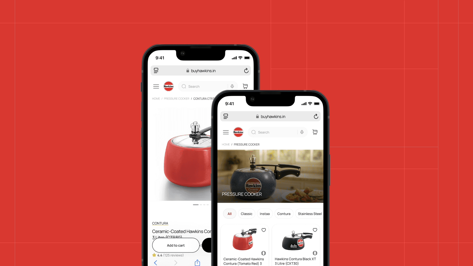
upGrad
Platform
Web & Mobile
Timeline
16 weeks

In-short, a little about the project…
This project focused on redesigning content-heavy pages and migrating them from WordPress to an internal CMS to improve engagement, discoverability, and organic lead conversion at scale.
What problems were we facing?
Organic traffic and lead conversion were underperforming despite strong SEO inputs
Article and exam pages showed higher bounce rates and lower visitor-to-lead (V2L) ratios compared to non-article pages
Content experience was fragmented due to platform (wordpress) and CMS limitations
Let's understand the problem in depth
We analyzed article vs non-article pages using two key metrics:

Bounce Rate
The percentage of website visitors who view only one page and then leave, without clicking any links or taking further action, indicating a lack of engagement

V2L Ratio
The proportion of visitors to a website that is converted into leads in a given period
Key findings
Article pages were built on WordPress, while non-article pages were on an internal CMS
Article and exam pages consistently performed worse than other sections
Comparing against similar ed-tech platforms showed the same gap
Further investigation revealed multiple issues with WordPress:
Frequent 502 errors, affecting reliability and SEO
Inability to support dynamic lead forms (users were redirected, increasing drop-offs)
High dependency on developers for even small changes
Poor flexibility for experimentation and personalization
So how did we strategise the solution?
We decided to:
Migrate article and exam pages from WordPress to the internal CMS
This included designing:
Article pages
Author pages
Article category pages
Redesigned exam sub-navigation (desktop & mobile)
What were some key design decisions?
Making the First Fold Content-First
Problem:
The first fold was cluttered with filler elements, banners, and secondary CTAs, pushing core content below the fold—especially on mobile.
Decision:
Removed non-essential elements
Prioritized headline, metadata, and content entry
Made layouts more compact and scannable
Impact:
Users could immediately understand page relevance
Reduced unnecessary scrolling and visual noise
Supported improvements in bounce rate and read time


Simplifying Exam Page Navigation (Desktop & Mobile)
Problem:
Exam pages had overlapping navigation patterns:
Same click triggered both dropdowns and page navigations
Global menu, sub-menu, and breadcrumb competed for attention
Mobile experience amplified confusion
Decision:
Clearly differentiated:
Global menu
Contextual sub-menu
Breadcrumb
Kept all sub-menu elements on the same page for SEO consistency
Impact:
Reduced cognitive load
Improved navigability across long exam pages
Maintained SEO structure while improving usability


Compact Author & Stakeholder Attribution
Problem:
Articles often involved multiple contributors, but showing all authors upfront consumed valuable first-fold space.
Decision:
Introduced stacked avatars with an expandable view
Allowed users to view full contributor details on demand
Gave content teams flexibility to assign multiple authors/editors
Impact:
Preserved space for content
Solved internal credit-sharing needs
Maintained trust and credibility signals for users

SEO-Driven Internal Linking Architecture
Problem:
Content existed in silos, limiting crawlability and contextual discovery.
Decision:
Designed an internal linking structure connecting:
Homepage
Article homepage
Individual articles
Author pages
Category pages
Impact:
Improved crawl depth and indexing
Strengthened topical authority
Enabled both users and search engines to navigate content more effectively

What did we achieve?
~82%
Increase in clicks compared to the previous period
~52%
Growth in impressions, indicating better SEO visibility
~20%
Improvement in CTR, reflecting stronger intent matching
Improved average search position, showing enhanced page quality signals
Consistent increase in organic sessions over time


source: Looker Studio integrated with Google Analytics

What I learnt after hand-off?
UX decisions can directly influence SEO and growth metrics
Designing content at scale requires balancing readability, performance, and system constraints
Platform choices (CMS) significantly affect design flexibility and experimentation
Further improvements
As I left the organisation, these were the improvements I suggested to be done:
Infographics section in CMS. Currently we use images for that, so we are looking a way to add svg to the formats
Improving the functionality of the sub-menu for the exam pages
Integrating the generic blog thumbnails for blogs without banner images